Captivating Content Part 1 -- Balance (Reposted Article)
Author’s Note: This is a previous 2023 post I wrote to illustrate the importance of balance, generally, but as it pertains to creating AI art. I used an AI definition of balance to create an AI prompt to create the images below. Human and AI working together = balance.
Idea Factory Blog
Are you tired of producing bland, unengaging content? Do you want to create visually striking content that captures the attention of your audience? Me too fam. I’m just an old dog learning new tricks and if I can help you, then I am down. All in. Let’s create.
Don’t make me say it. Fine. You win, I’ll say it. What #(iF) we learned from each other, and had fun during? Hmm. (before I go into a tangent, let’s charge forward).
In part 1,I’m gonna drop some tips and tricks I use. A quick overview from a graphic design perspective as well. The goal, creating content that not only catches the eye, but maybe, just maybe has an impact on the viewer. Ya know, I’m not even 100% that I’m creating that type of content, but until someone tells me stop, I’m gonna assume it’s working. And...away...we... go..
The first step in creating visually striking content is understanding the principles of graphic design. These principles include things like balance, contrast, repetition, & hierarchy. By incorporating these principles into your content, you can create a sense of order and harmony that will draw your audience's eye and keep them engaged.
I have blogged, tweeted, and preached the first topic, ad-nauseum, so it should not surprise you that we’re talking Balance in part 1.
“Seek it always, embrace it when it comes” ~the lunatic behind this keyboard.
BALANCE:
When it comes to creating visually appealing designs, balance is key. Balance refers to the way elements are arranged within a design to create a sense of stability and harmony. There are three main types of balance: symmetrical, asymmetrical, and radial. Balance fam.. I’m telling ya.
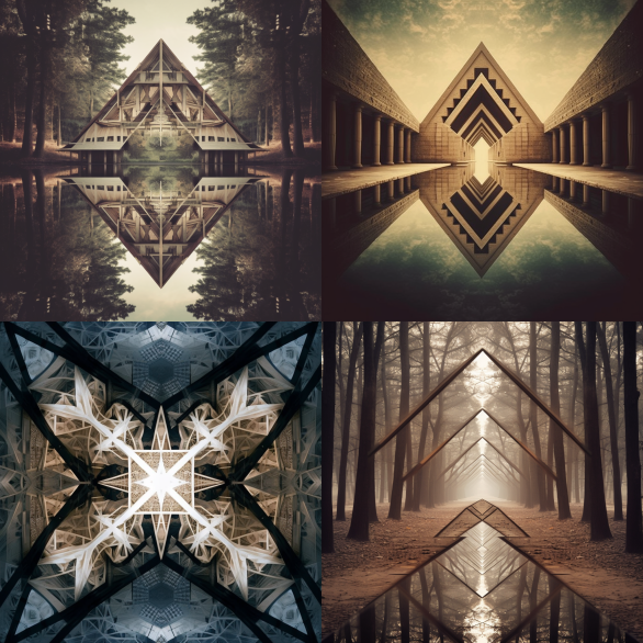
Symmetrical balance is achieved by arranging elements evenly on either side of a central axis, resulting in a mirror-like effect. My math brain loves symmetry. (maybe a tumor, who knows).
/imagine: Symmetrical balance is achieved by arranging elements evenly on either side of a central axis, resulting in a mirror-like effect. My math brain loves symmetry. --v 5.1
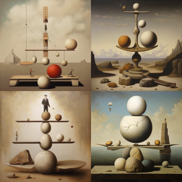
Asymmetrical balance, on the other hand, involves arranging elements unevenly but still achieving balance through contrast and hierarchy. (I have to work at this. See above reference to symmetry).
/imagine: Asymmetrical balance, on the other hand, involves arranging elements unevenly but still achieving balance through contrast and hierarchy --v 5.1
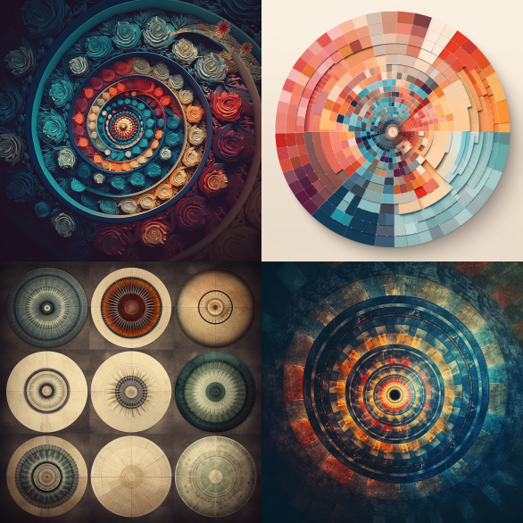
Radial balance is achieved by arranging elements in a circular or spiral pattern, with the focal point at the center. Experimenting with these different types of balance can help you find the perfect balance for your content and create designs that are visually appealing and engaging.
/imagine:Radial balance is achieved by arranging elements in a circular or spiral pattern, with the focal point at the center. Experimenting with these different types of balance can help you find the perfect balance for your content and create designs that are visually appealing and engaging. --v 5.1
And now, to have some fun, I am going to put these exact descriptions into Mid Journey and show the results. I expect 1 out of 3 to work and the other two will be out in left field. And that’s ok, you know why? Balance.
In my mind, the ability to keep that balance and explore the limitless realm of A.I art is to not only understand the concept of balance, but to seek it. It will help your designs, or should I say, it has helped my designs. It’s very easy to go down a rabbit hole searching exactly what you want vs stepping back and looking for that balance. Damn,
I love the smell of balance in the morning.
As it turns out, A.I went 3 for 3. LFG
Transform that content creation miss (or whiff) into a phenomenal What #(iF).
Part 2 will be Contrast.


